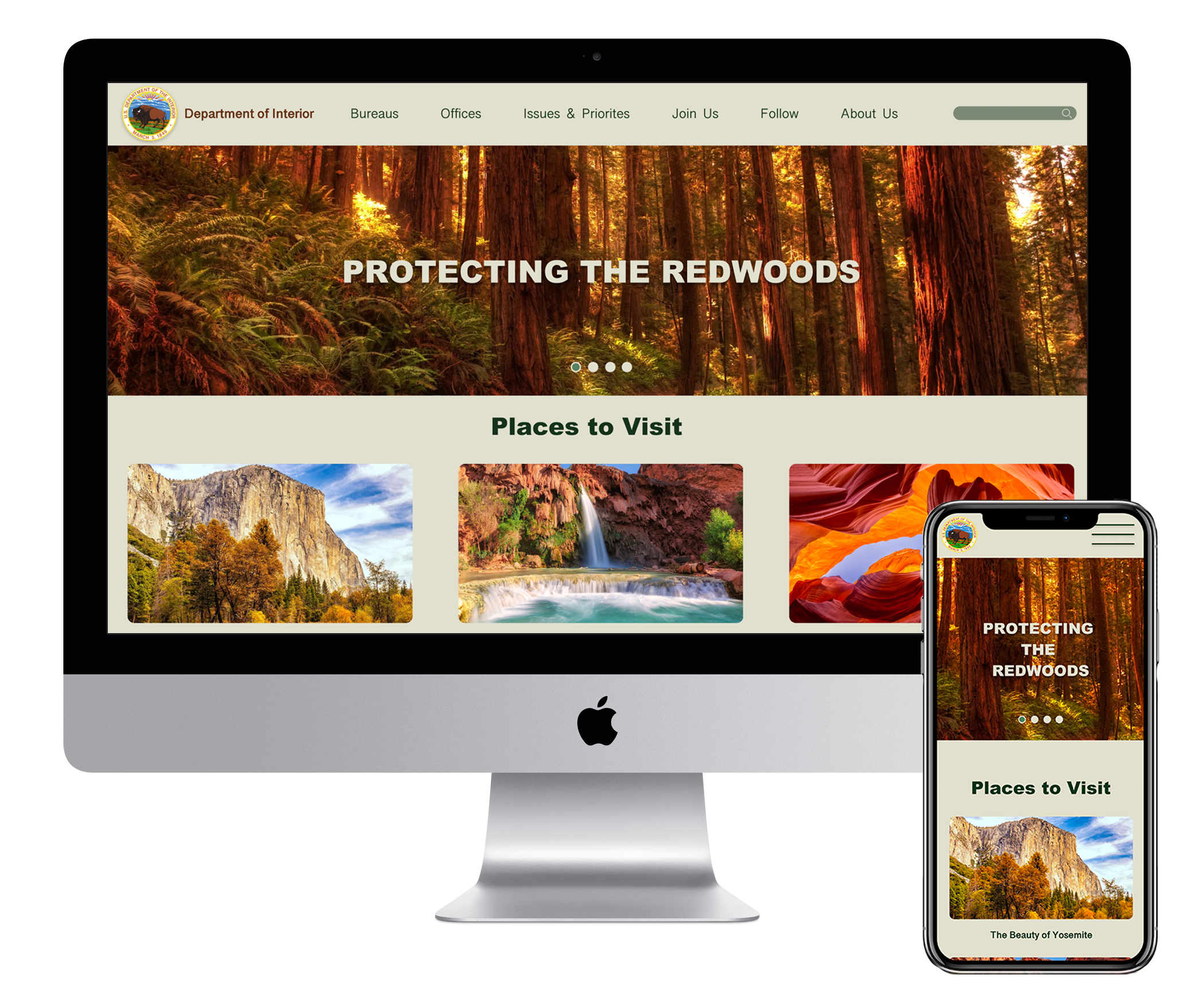
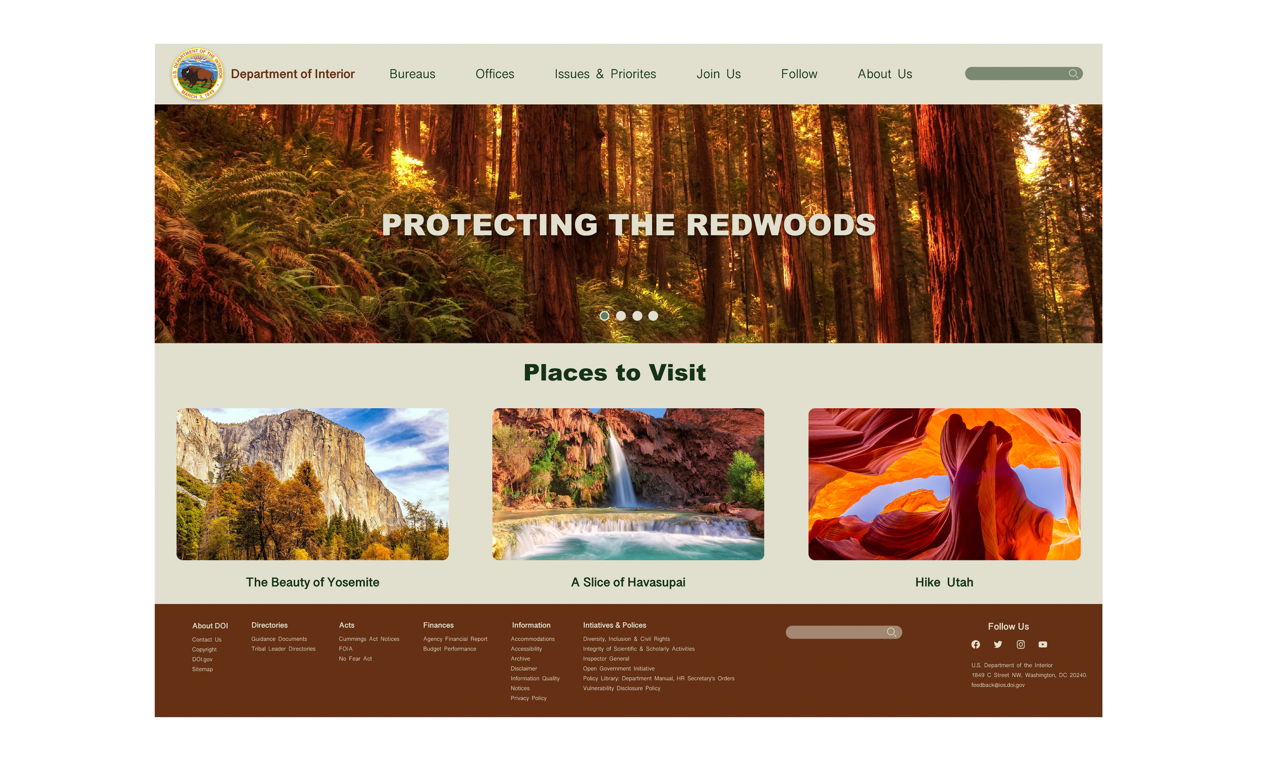
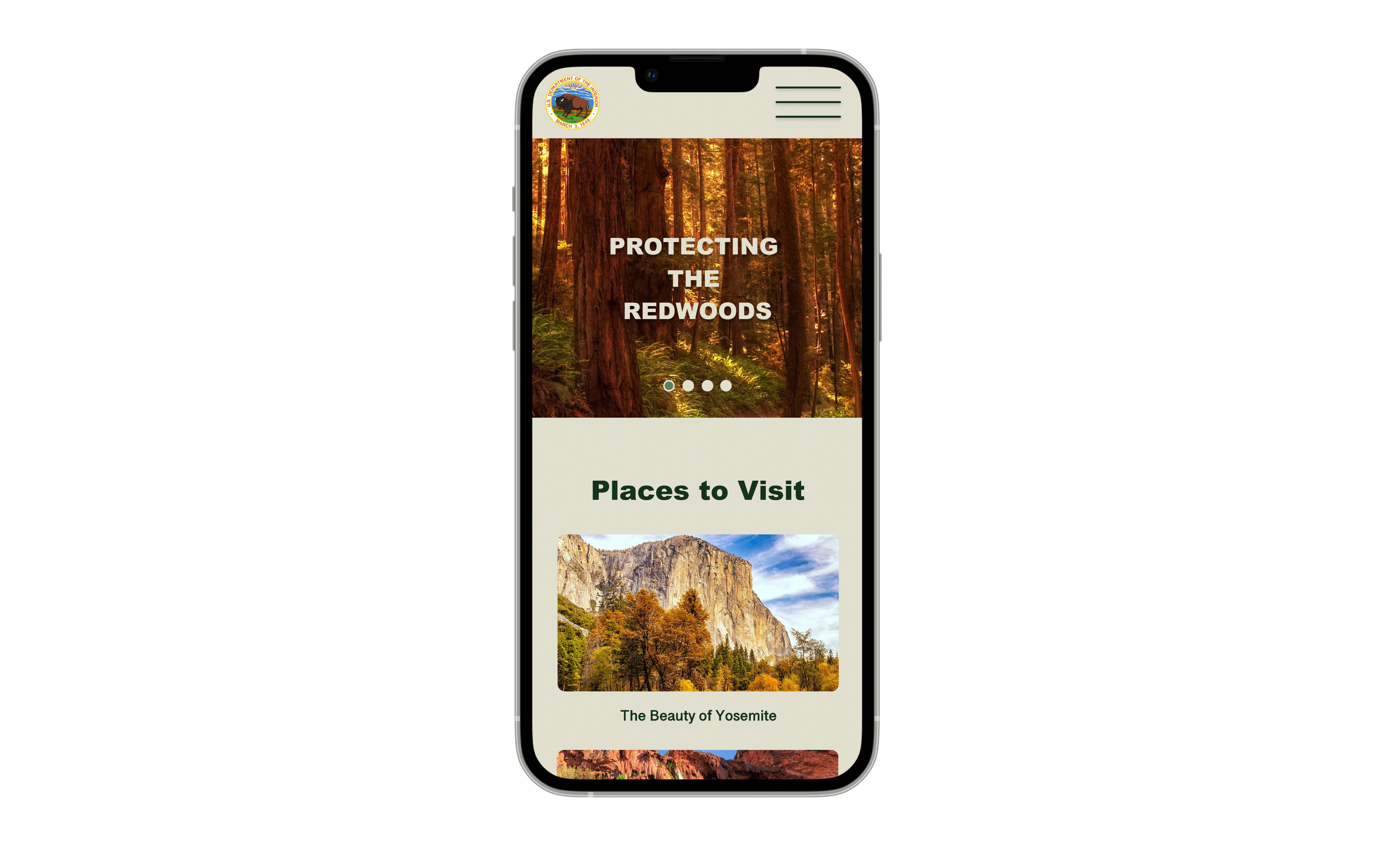
Discover From Within
The Department of the Interior is a website whose sole purpose is to to keep its readers updated on policies and bills that affect the national parks and protected lands in the United States.
The site was in need of a complete redesign.
THE PROBLEM
The Department of the Interior is a government website that is out of date and is in need of a complete redesign. Users are frustrated about the sites current functionality and stakeholders are wanting to improve the overall experience for visitors.
The solution
Provide a seamless user experience for the DOI visitors and readers. The content within will be showcased in an easy to digest manner and void of clutter and distraction. All pages and information will be reorganized and categorized easily for users to locate and learn more about the topics that are of interest to them.
Responsibilities
Our Role: UX/UI
Tools: Figma, Miro, Invision
Time: 3 Weeks
PROTO PERSONA
DAVE JONES
Dave is a Water Conservationist who visits the Department of the Interior website regularly to stay up-to-date with news, articles, and general information provided by the site.
His goals in visiting the site include:
Needs to be able to find data for his research quickly
Wants to keep up on new developments with national parks
Needs information to communicate with people whom he works closely with
heuristic evaluation
-
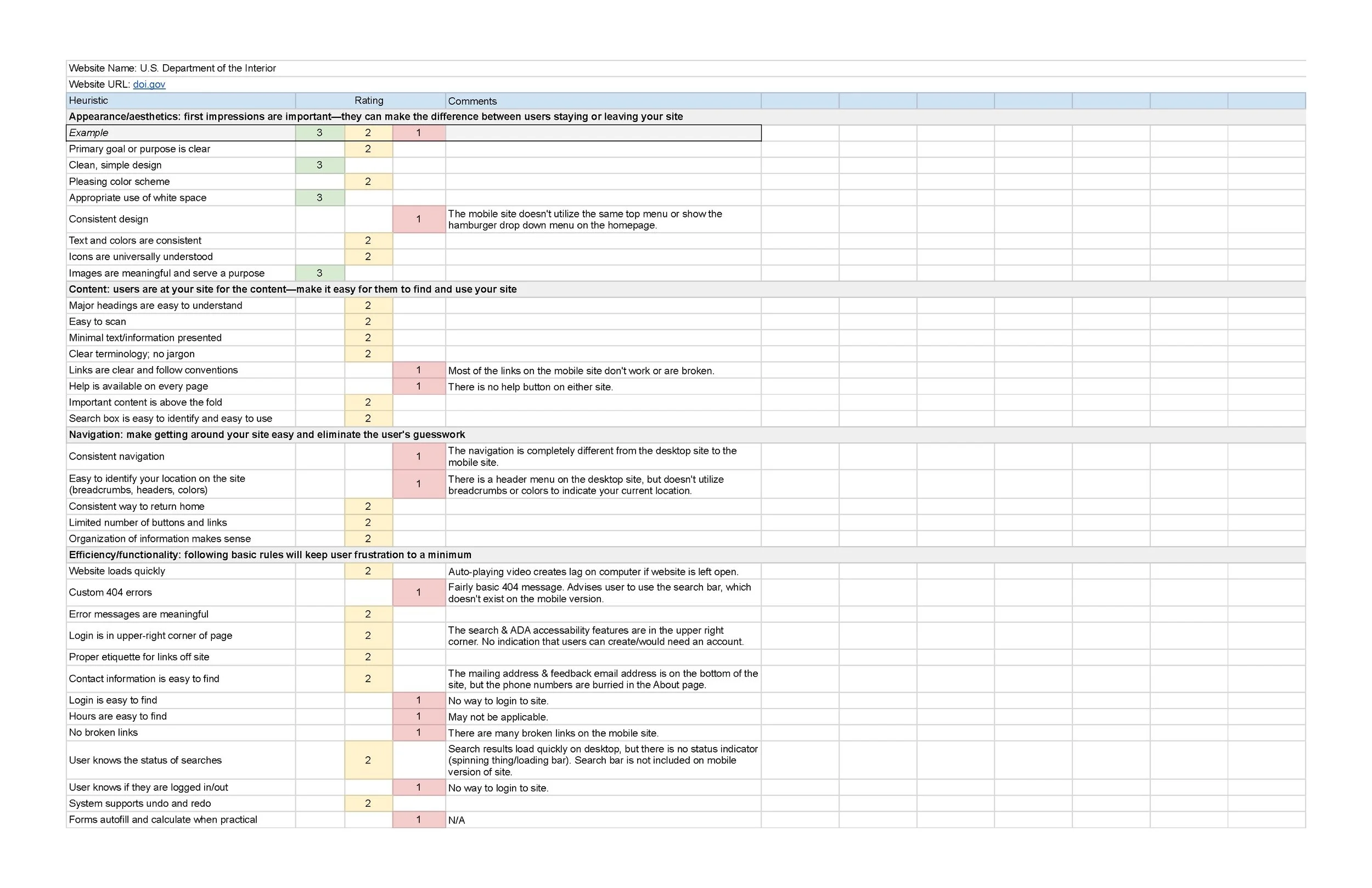
Evaluation
These are the evaluation results of the current websites navigation, features, structure, content design, and user flow
-

homepage Breakdown
A breakdown of the current websites homepage. Itemizing each element and portion of the website in each of the sections
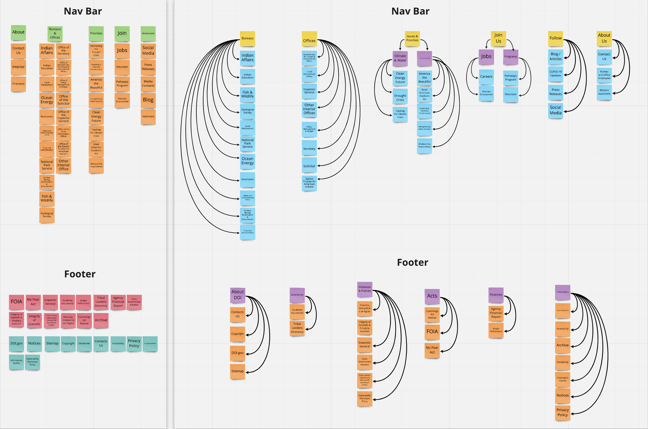
CARD SORTING
A / B Testing
-

A
Wireframe A showcases a different drop down menu style. The lo-fi iteration was the first design approach taken for the navigation drop-down menu
-

B
Wireframe B showcases the second option created in the design process. A/B testing was done on a group of users to see which was more aesthetically pleasing. After testing was complete, the data showed that majority of users preferred the look of option B
A / B Testing Results
-
Brandon
“I like that the font is smaller and not in all caps on the new design. It makes that more consistent with the font throughout the rest of the page
-

Ryan
“For coding purposes, the new design (B) would be much easier for developers to make it respond down to a smaller screen. The design of B is more modern too
-

Whitney
“I like the cleaner look of B. It’s not as clunky with the gray background bar, plus I think it looks more inline with the one created for the mobile version.”
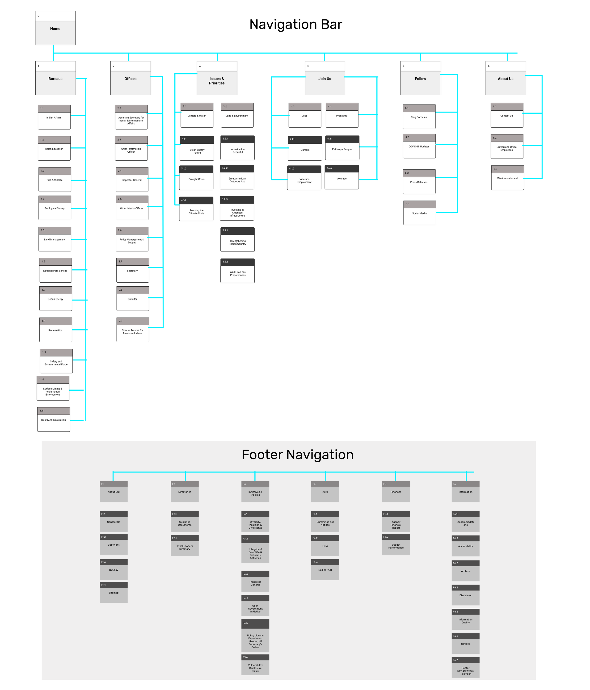
SITEMAP
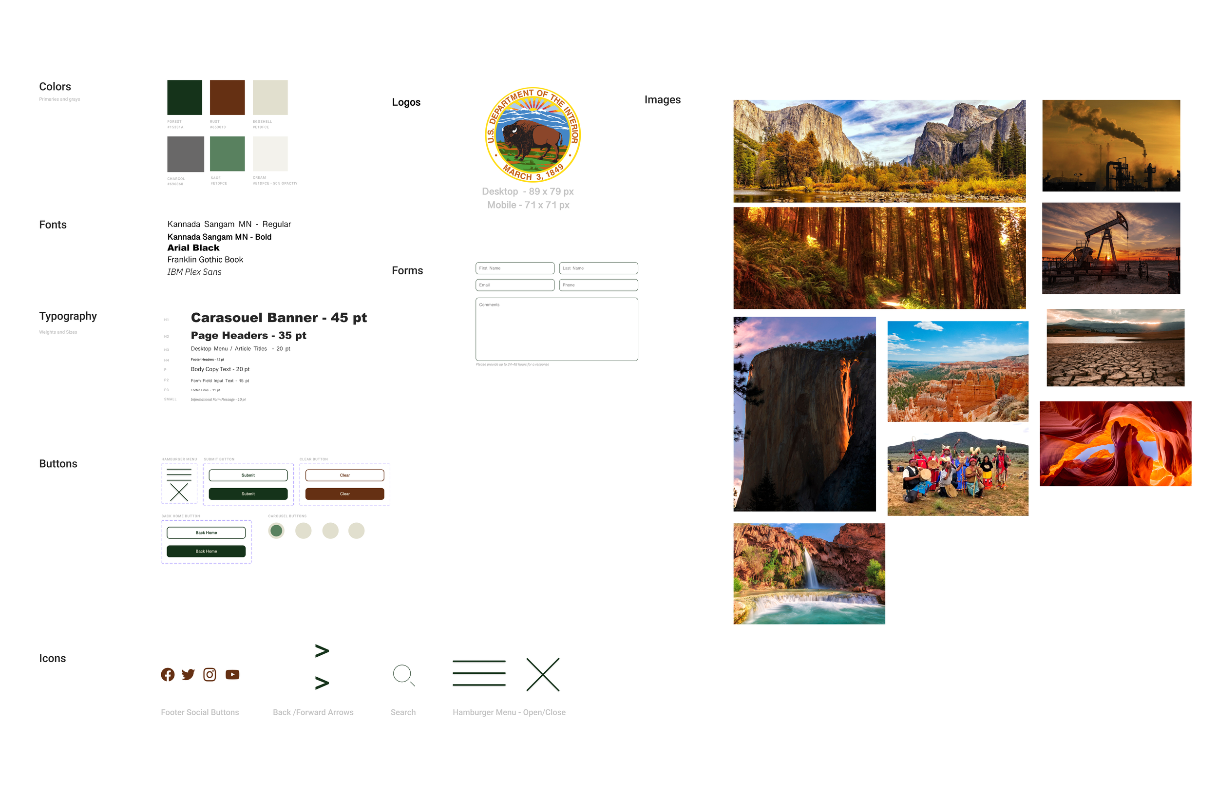
Style Guide
mockups
Desktop protoype
mobile protoype
Final Thoughts
I need to focus more on creating components and variants with proper padding and alignment
Make sure each component and the variants of them work seamlessly before designing other elements of the site
Card sorting was an invaluable tool during this project because the navigation bar had an immense amount of links and pages to reorganize
User testing will need to be implemented again after various pages are made to see if the redesign is still headed in the right direction
Moving forward, I want to create more pages and make iterations on those as they develop


